Category: Design Process
The election last November shook me, as it did so many people. I became fascinated with understanding these “other” voters so that I could see, through their eyes, these issues that seemed so black and white to me. I started to see the complexities in the challenges of American identity, job creation, political accountability. I began to search for books that might explain some of it, and there were a few that helped to describe the problem, but of course, most academics don’t propose solutions. That’s what designers do. But these topics are so much more complicated than the bounded problems we typically work on when there is a client, a set amount of time, a set amount of money and an expected outcome.
What would it mean to work on a design challenge that could take 100 years to solve? 50 years, ok, 20 years, if that helps it feel more plausible.
It turns out that Terry Irwin, the head of the School of Design at Carnegie Mellon is exploring this right now. She has instigated a new practice in Design called Transition Design, which comes out of her Ph.D. research with ecologist Gideon Kossoff, and philosopher turned design professor, Cameron Tonkinwise. The three of them propose that in response to the failure of Ecology and Sustainability to sufficient change behavior and improve attitudes toward more long-term thinking about the earth, Design may be able to help. But only with new tools to handle the complexity, new mindsets to deal with such long-term challenges and new training in systems of change.
I have to admit that I never personally connected with the Green Design movement, so I was surprised to find myself excited about Transition Design. But I think it is because Transition Design can be used to tackle any number of societal issues we face today, and it approaches with a great deal of empathy and a curiosity about the causes and mindsets that are at the root of the problem.
I was invited to attend a 5-day course in Spain with Terry, Gideon, and Cameron. The course had an incredible diversity of attendees: some service designers, some design professors but also community organizers and NGO workers– from all over the world. The attitude these three leaders take is that this discipline of design is just beginning, the same “problem worrying” they apply to Transition challenges, they apply to the development of the tools and methods themselves. It is all work in progress, and they invite us all to try it out and build on what is there.
We believe that rich stories and visual frameworks help to establish a new understanding of what is meaningful to people. This foundation helps researchers, designers, engineers and business leaders develop strategies and concepts together, based on a new, shared perspective.
1. Seek to be surprised
Relax into the trusted approach. Absorb everything because you don’t know where the solution will be. Resist narrowing too quickly.
2. Collaborate to learn and teach
Bring stakeholders into the field—and through synthesis-— to build a shared understanding of the opportunity well before the final deliverable.
3. Form a point of view
Innovation research is more of an art than a science. Curate a compelling call to action rather than reporting on everything observed.
4. Visualize relationships
Frameworks are powerful tools that can highlight important aspects of your story. They can be used again and again by stakeholders.
5. Focus on the elements of a good idea
Most organizations don’t suffer from a lack of ideas, they struggle with a lack of focus or a strong reason to pursue the right ideas.
Our goal is to establish a shared understanding of the opportunity area, then we can identify the elements of successful concepts. We generate the solutions together, with our client’s in-house expertise.
We have 3 favorite tools that help us collect great stories and build more beautiful presentations in the end:
– LiveScribe Pen: This pen captures audio and uses special paper to link the audio to whatever is written at that moment in time. We use this to be sure that we capture exact quotes. It’s especially useful to use when shadowing someone during an ethnographic observation– where you might be wandering through the mall or sitting quietly in their home all day. You can leave the pen running all day, capturing any small bits of conversation without turning a recorder on and off.
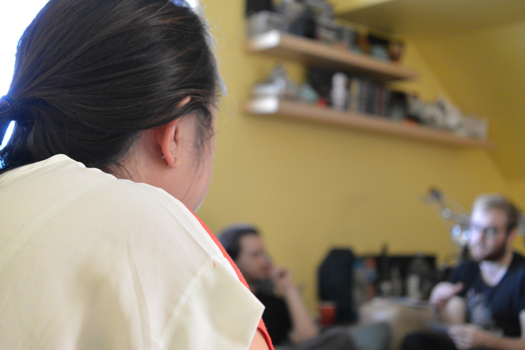
Our favorite camera allows us to take more dynamic photos, with strong focus contrast between foreground and background
– Lumix Gx7 Camera. This camera takes great photos in low-light (essential for in-home interviews) and has a touch-screen interface that allows you to touch the screen to indicate where to focus the lens. This helps us capture dynamic photos that focus on the objects or people that are most interesting.
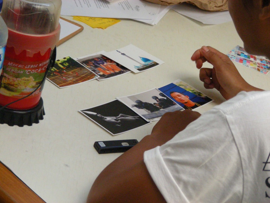
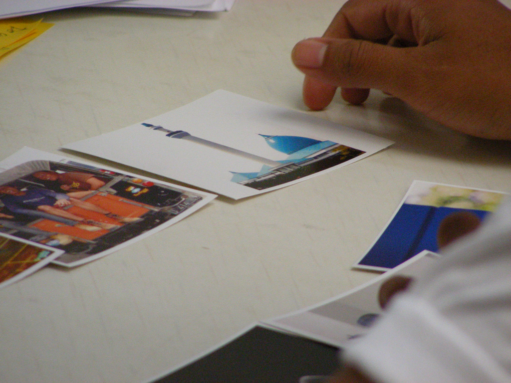
– Photo Card Sort. Years ago I created an InDesign document with photographs sourced from as many different terms I could think of to type into Flickr and pull from my own persona photos. I focused on amorphous, non-concrete words like “communication” “spirit” “inspiration” to lead me to photos that could be interpreted not for the object they represented but what they could symbolize to people. We’ve used it again and again to prompt conversation. It works for several reasons:
- It gives people something to look at besides the person interviewing them.
- Beautiful photos encourage them to be creative.
- Asking them to describe opposites shows the facets of an experience. For example it was very revealing when we asked, “Choose three cards that describe how you like to communicate and three that describe how you don’t like to communicate.”
- The limited set of responses forces them to think about different aspects of their experience, they have to reflect on their feelings and the photos. Sometimes it’s a stretch, and they admit that, but it’s still interesting. We are looking for inspiration here, and this helps.
Contact us if you would like a PDF copy of these cards.
What tools do you love when you are seeking inspiration from field research?
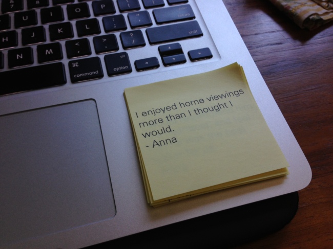 In a project with a short timeline or small budget for travel it can be great to add an email portion to cover additional locations– if location matters. I am studying the real estate process right now, and that does vary a great deal from place to place. But we can only travel to a few cities in the month we have for research, so we have recruited participants in 3 additional cities to add color.
It is working really well. Some participants are treating it like essay questions on the SAT– I’m getting Word documents and multiple page answers! Granted, I am incentivizing them well, $75 for 8 questions.
Some tips for this type of research:
– Space the questions out over time so that you can be open to people’s activities or experiences changing. I have a bit more than a month to collect responses, which is a long time in the home rental– and sometimes the home-buying or selling experience.
– Try to build a rapport. It can be difficult because you are in the field while the responses come in, but I try to make it clear that the responses are valuable and inspiring and that I want to know more!
– Collect responses into a Google Doc or other note document, sorted alphabetically, because it can be hard to keep track of stories that come in at different times.
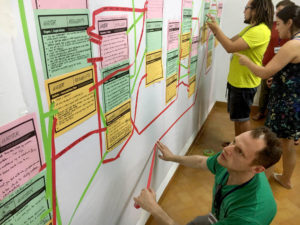
– If you are planning a post-it note affinity diagram, you can include emailed responses by printing onto post-its that have been stuck onto an 8.5×11 piece of paper. Obviously they need to go into the printer “heads first” but most printers can handle this. I am working in InDesign, I printed colored text boxes onto a blank sheet of paper first so that I would know where to position the post-its. During synthesis we will see the email responses side by side with our in-person interviews, but will know, at a glance, which were from email because they are typed text.
I know, this is blasphemy in many researcher circles. We don’t research ourselves! We are too biased!
But if you know that, then you’ll take the findings with a grain of salt. So don’t miss the opportunity to both learn from “expert” users and give your employees a chance to have their voices heard.
At the start-up I’ve been working for, we have about 40 employees now! woohoo! Big for a start-up. I had developed a survey for our customers to understand their first-impressions of our product. Someone on my team– not me, sadly– suggested sending the survey out to our own employees before sending it out to our customers to get a sense of the data we might get back. It was excellent. Fifteen people responded in the first two days: a 37.5% response rate!
I pulled together a quick report on the results– clearly labeling this as an INTERNAL USER survey, but learning quite a bit from the responses. Our internal employees range in skill level from pretty good with a computer (Sales, I’m looking at you) to highly trained expert– so when people have trouble with parts of the interface, it’s probably a significant problem. And because we use our product internally for almost every type of communication, we run the product through the paces and have a more nuanced idea of how it could be improved than most of our current customers who are only just getting up to speed.
The survey took about 10 minutes to complete. It took me about 2 hours to analyze the data and throw it into Keynote. I didn’t have to spend any time creating the survey because I created it to send to our users. And I deployed it through SurveyMonkey, so that was free as well. And the results have helped our product team prioritize some new features. And all of our employees had a chance to have their say. Well worth it.
I have been teaching “Design Methods and Research” to undergraduates in the Industrial Design program at CCA. It is a required class, which is good and bad. The department believes Design Research to be useful for their students, but the students may not have CHOSEN to take the class.
I am often contemplating what the essentials of Design Research might be. If you could only teach a few elements of Design Research, would you focus on a process or technique? Would you put most of your energy into making them good interviewers? Or try to make all the basic methods familiar to them? Would you cover the cut-and-dry basics that will help them to evaluate their designs, or focus on the more experimental methods for inspiration?
I have to admit that cut-and-dry is not where my passions lie. And to be a good researcher in that way requires much more than a single class. So Lucie and I have focused on the process of user centered design with the goal of understanding people in order to inspire great designs. A difficulty in teaching this way is that the process is vague, the tools are vague, there is a reliance on individual imagination and interpretation that takes time to develop when you don’t know or trust the process. As a result, the first half of the semester is confusing and loose for the students, but exciting in the end.
Still, I am always looking for a better approach. Today, as I was reading through the advice from selected graduating students to offer as the graduation speech, one anonymous student stood out because he or she was the only one to talk about gaining inspiration from others. Most art students will talk about their own creativity, thank their teachers for making them into confident, passionate, inspired artists. But this student said this,
Making impact doesn’t just mean inviting people into your world and your vision, but immersing yourself into the worlds of others — even if it means exposing your weaknesses, fears and aversions. This is because the division of our identities as artists or non-artists are inauthentic and increasingly irrelevant. Therefore, our community’s role in society is to help expose the flaws in relying on such divisions of identities in service of a more united, sustainable, beautiful, and meaningful world.
I was inspired by that. It makes me want to focus on the ENJOYMENT of Design Research. To focus my energy on helping the students love to talk with others about their work and love the process of learning about and design for another.
I coul imagine breaking it down into three areas:
– Understanding other contexts by immersing yourself
– Rich conversations to inspire
– Gathering honest feedback
It feels like more of an Art class than a Design class, but that could be a good thing. Inspiration is more useful than validation. And serious researchers are better at validation anyways. My director at Yahoo told me once that his goal was to create such an informed set of designers that we would not have to conduct any usability research– the designers would have so much knowledge going into the design process that they would be their own testers. Therefore, I am more interested in setting my young designers out on the right foot in their design processes, informed and inspired.
 I am thrilled to be teaching “Design Methods & Research” this semester at California College of the Arts with Lucie Richter.
We are at midterm and have assigned the students a final project that should explore the core skills we expect them to learn:
Inspiration: develop skills to observe people in a way that inspire better design
Context: explore the full picture of where designs live
Design for use: propose solutions that fit appropriately into a system of use
Systems Thinking: understand multiple stakeholders and the effect of design choices
Empathy: develop a deeper understanding of others
Depth: seek to gain a new perspective on why people choose the products and services that they do
Ethics: respect and responsibility before, during and after observations
Synthesis: move beyond the obvious with new insights
Storytellingshare insights in a thoughtful and generative way
Helen Walters writes, once again, about how Design Thinking isn’t the magic bullet that some of us like to think it is, in a FastCo post. I found this paragraph helpful in articulating the value proposition of Participatory Innovation:
For designers to have strategic impact, they need to work with managers to ensure that the business elements of a project are being catered to, too. That might not play to the innate strengths of designers, but it’s vital for leaders to figure out ways for everyone to get along so that innovation can be a team sport. Otherwise, we’ll be left with bizarre stories such as the one that ran recently in The New York Times, with a Smart Design director arguing that the Flip camera was, in fact, just about perfect. Just not so perfect that Cisco didn’t decide to discontinue making the product. Executives don’t always make the right decisions, of course, and perhaps Cisco management did make the wrong call in this instance. But proclaiming that smartphones had no bearing on that discussion and arguing that all of the design decisions were correct smacks of hubris and myopia. Design doesn’t — shouldn’t — live in a bubble and designers need to bridge the divide between their world and business, not just lob ideas over the fence and hope for the best. As it stands, it takes a particular type of person who can span those two worlds. Those are the must-hire employees of the future.
Participatory Design acknowledges that we, as design researchers, are not seeking truth. What we gain from our interactions with participants is biased toward the questions we need to answer. The ideas that spark innovation and that are most inspiring to us as people who are intending to solve a problem—can come from many places.
With that in mind, Brendon Clark inspired me with the ways in which he has been exploring the boundaries of how much control he can give to others when he works with users and stakeholders in the field. Yesterday, in a chat with Brendon, a great influence of Participatory Design thinking for me, I realized myself how little control I give to those around me. He asked why.
“I… am trying to preserve the accuracy.”
Yet I have always acknowledged that the purpose of my approach is inspiration. When people ask me how I can stuffy only 6 people, I tell them that it only takes one clarifying story to change everything.
If I gave up some control to the designers and product managers in the field with me—to allow them to pursue the topics of the conversation that are most interesting—mightn’t we all be more inspired?
And the Participatory Design movement in Scandinavian, which I admire so much, has always been about bringing the user into the conversation as a equal participant. Easier heard than acted upon, apparently.
I see now how I tend to keep users in the dark during my field sessions—trying not to bias them by telling them what I want to know, or what I find most interesting. I remain neutral in the conversation– open and supportive– but still neutral, holding my card sort close to my chest, so to speak.
Brendon has been studying and writing about Performance as a way to put participants at the center of the conversation for innovation and design. He began his work, at the intersection of Anthropology and Participatory Design, with a focus on users and is now expanding his work to include stakeholders as participants as well. He says, “When you give people a stage, they naturally perform.” He sees our role as researchers as the people who create the stage.
 Design’s relationship with Art has always been filled with tension. The respect has never felt entirely mutual. But the influence of Art on Design has informed more that the designer’s aesthetic sense, it reminds us to be accountable to the societal aspects of creating artifacts as well. Art has a longer history of influencing society, and Design can learn from that.
Once you remove the artistic sensibilities of creating great work to offer into a cultural experience, the artifact one designs, or the experience on affords through a series of designs, the exercise becomes mechanical, technical.
HCI appears to have a stronger influence on the Interaction Designers in Silicon Valley these days than Design schools. Interaction Designers are more often expected to code, to move straight to software prototypes. Which shifts the focus of their education toward the mechanics of design, rather than the art and theory of design.
I worry when I see designers happy to execute on specs set by others, rather than asking questions about Who, When and Why. HCI, in making the process a technical task, makes the design process internal. HCI designers are armed with rules, structures and standards to apply to interactions. They don’t explore the context of use beyond the human factors, the inputs and outputs, the mechanics, because the right puzzle pieces are in their head to be figured out.
In the book, “Rehearsing the Future” by Halse, Brandt, Clark and Binder, the authors offer an excellent perspective on the similar evolution from user-centered design to participatory design (p. 13) in their manifesto:
The standard principles for what constitutes user-centered design are often not attuned to capturing the most influential aspects of the human experience. As designers are increasingly facing open assignments in complex social arenas where the definition of the problem is not given, but part of the challenge, new guidelines arise that the classical guidelines for good design do not address. […] The answer has less to do with the right order of information than with the socio-cultural situation in which it takes place.
It takes a flexible mind to gather a holistic understanding of complex contexts in order to find complete solutions to the systems problems that design problems look like today.


